Mammamia Covers
We Turned Variant Choice Into Checkout, 158.54% PDP Conversion
For a specialty cover retailer with 200+ variant SKUs, we rebuilt the storefront UX and merchandising logic so buyers stopped hesitating and product pages converted.
4 min read+158.54%
CVR (Product Pages)
+126.53%
CVR (Landing Pages)
Multi 7 Figures
Revenue
Call for change
They were entering a slow season while paid performance shifted, and the storefront was running on a legacy, hardcoded theme that behaved more like a static site than commerce.
What happened
SYNOV Agency rebuilt the Shopify experience and tightened the decision path on PDPs so buyers could choose the right variant fast.
The key change was merchandising: we reordered how customers browse variants so selection matched real buying intent, not internal taxonomy.
The challenge
The store had 200+ variant SKUs in essentially one product type, and buyers were getting stuck because options weren’t organized the way shoppers actually think.
At the same time, paid media conditions changed and the site’s legacy, hardcoded template made it hard to remove bounce points quickly.
The results
After relaunch, the team removed major bounce points and stabilized the on-site path in the first two weeks.
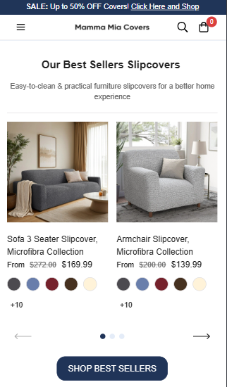
Variant selection became clearer because categorization matched how shoppers evaluate covers (color-first, not internal material logic).
Engagement improved by keeping users in-comparison with deeper content and visual popups, instead of forcing guesswork.
The store moved from “too many choices” to a repeatable PDP structure that can be applied across similar variant-heavy SKUs.
The approach
Customer-led market read: digital market research with custdev insights to understand how shoppers compare and choose variants.
Storefront rebuild: full Shopify revamp with a higher-converting template designed for faster decisions on key pages.
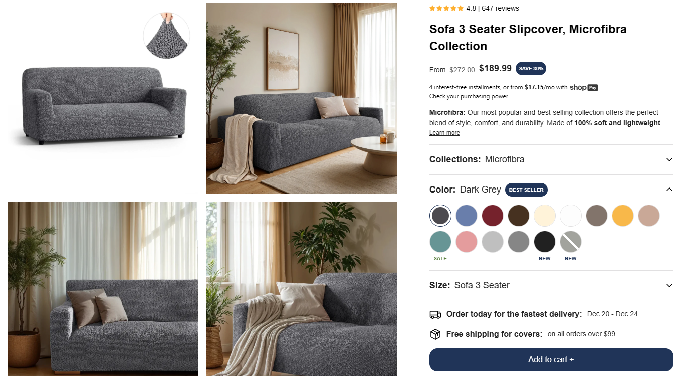
PDP decision support: customized UX widgets, PDP frameworks, and product photography guidance so buyers could “see it” and move forward.
Merchandising fix that matters: shifted primary browsing from fabric-first to color-first because shoppers treated fabric like color and it caused confusion.
Ongoing performance guidance: weekly consulting across Meta + Google, plus weekly SMM/content creation consulting to match the new demand environment.
Looking ahead
With a working decision path in place, the same merchandising logic and PDP structure can now be reused across additional collections and new variants.
The next lever is extending the “choose confidently” pattern to more entry points so comparison starts earlier, not only on PDP.
Weekly media guidance continues to stay aligned with platform shifts, without relying on a fragile theme.
FAQ
Does this work when most SKUs are basically the same product with variants?
Yes—this is exactly where it works best. When the real problem is “which option is right,” the page must guide selection instead of listing variants like a spreadsheet.
Why did changing category priority matter so much?
Because shoppers were using “fabric” the way they use “color,” so fabric-first navigation created hesitation. Switching to color-first matched the customer’s mental model and reduced confusion.
Do you need a full rebuild to fix conversion issues like this?
Not always—but if the theme is effectively hardcoded and behaves like a static site, it blocks fast iteration on the exact bounce points that matter. In this case, the rebuild removed that constraint.
Is this primarily a paid media problem or a storefront problem?
If paid conditions shift but the storefront can’t convert comparison-heavy traffic, spend can’t carry the business. Here we treated the storefront decision path as the foundation, then supported it with weekly Meta/Google guidance.
What did you change on PDP to keep buyers moving?
We added decision-support widgets, clearer structure, and stronger visuals (including guided photography direction). The goal was fewer unanswered questions per scroll, so choice turns into checkout.
How do you increase engagement without adding “fluff” content?
By making comparison useful: related products, clearer variant visuals, and focused popups that answer real selection questions. It’s engagement that reduces hesitation, not engagement for its own sake.